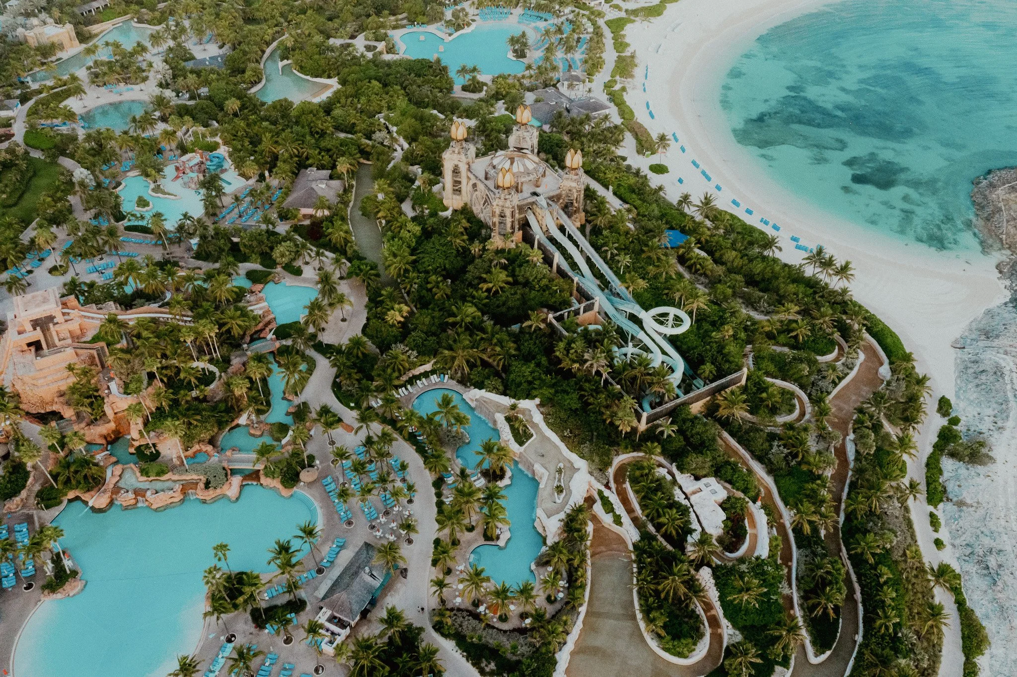
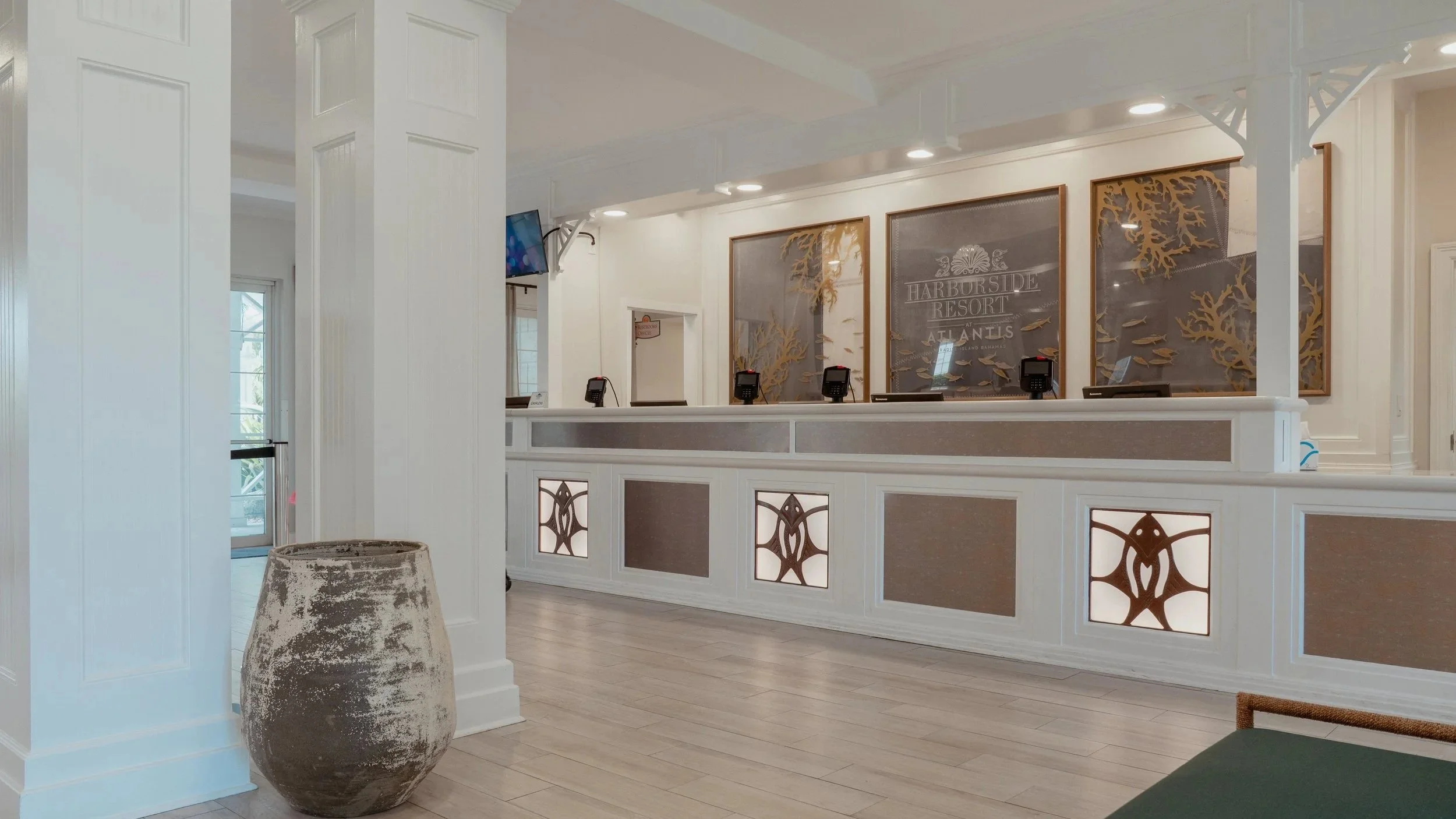
HARBORSIDE ATLANTIS BAHAMAS LOBBY
There is for most projects, a tightrope to walk between paying enough respect to the attributes which make each property unique - and delivering an artwork concept that is too ‘on the nose’ and obvious.
Our brief and tightrope was to create a lobby which felt transitional; not in a design sense but in an evocative sense. Our aim, to evoke a sense of adventure in guests, signalling that as you transit through the lobby to off resort, the Bahamas was ready and waiting to play host to whatever unscripted adventure you felt like having that day. For the team and I, navigating through ‘kitch’ to arrive at ‘engaging’ was a fun challenge and we were super pleased with the results.
During our R&D I’d felt inspired by the work of Damien Hurst - his ‘Treasures From The Wreck Of The Unbelievable’ exhibition (which seemingly everyone disliked but me) it PERSONALLY really struck a chord. I felt that our strongest hand was to fuse the integral maritime traditions of the harbor with the beautiful things that can happen to items left to the mercy of the ocean.
The best example of this would be the artwork which now sits behind the check in desk. I decided that the only way to bring the authenticity of sunbleached sails was to frame real, retired sunbleached sails which we purchased from a nearby ship yard, along with other worn and recycled sailing equipment which made up other pieces in the design.
There’s something so enigmatic about being underwater - regardless of how clear the water is (and the Bahamas boasts some very clear waters) visibility rarely exceeds 75m. I wanted for the pieces behind the check in desk to feel like you could snorkel through them. With clear nods to buried treasure in both the weathered gold frame moulding, the seaweed and the distressed gold fish swimming across the 3 panels creates the depth and dimension that we were looking for.
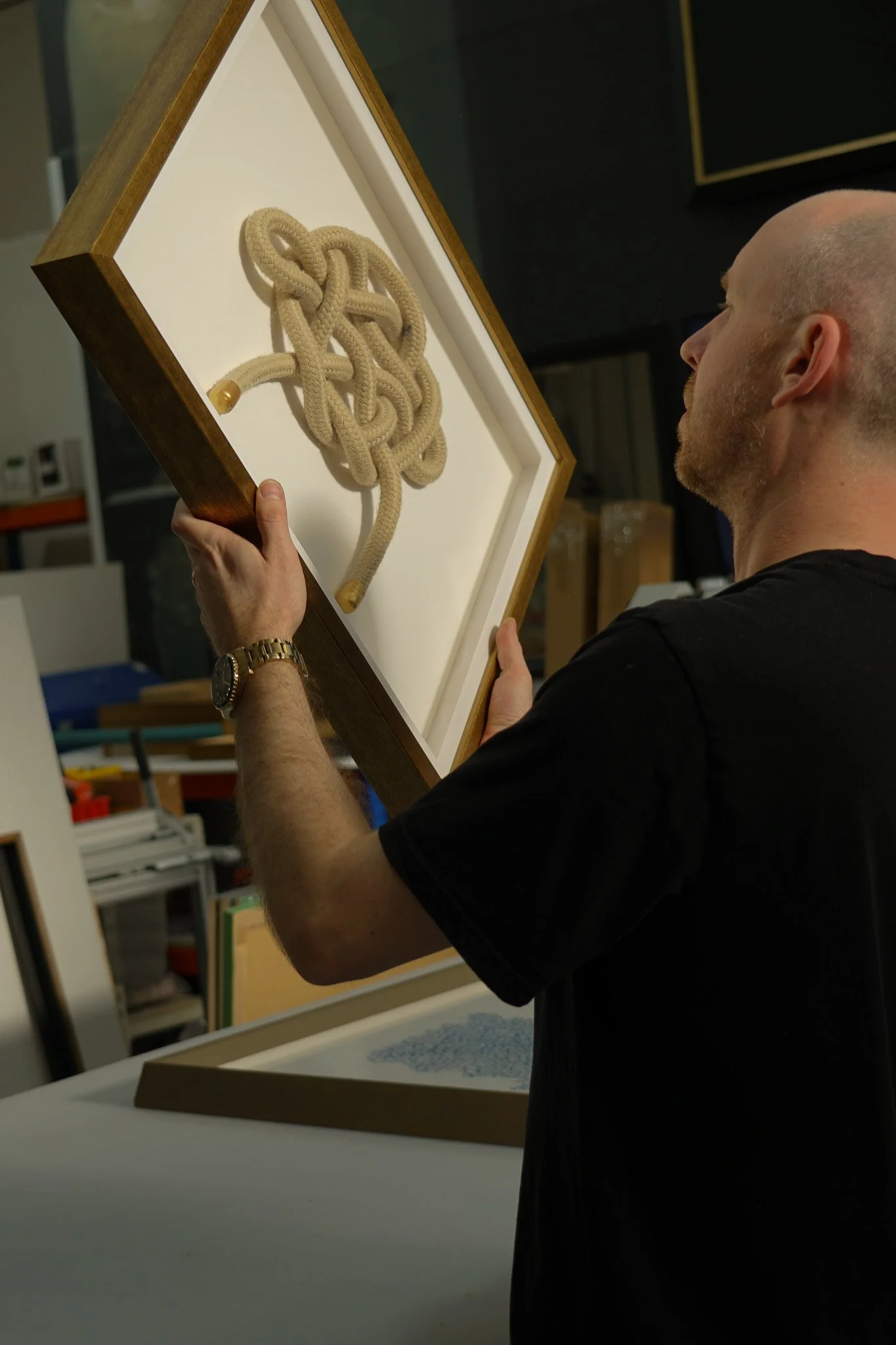
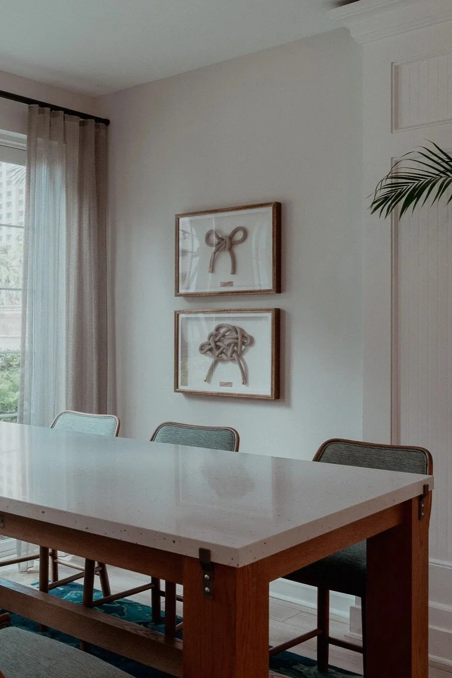
I liked the idea that the choice of framed knots that we used in our deep framed nautical fastenings weren’t performative but rather a celebration of seafaring traditions with real world knots that serve practical purposes outside in the marina.
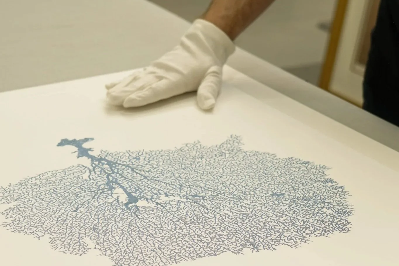
To continue the celebration we framed using the same distressed gold frame moulding, Blue tone heavy bell diving helmet prints on beautiful English Watercolour paper and some delicate seaweed watercolours. Each was floated using our luxe technique which I love for creating tension between traditional subject matter and more refined means of display.
To overlook the function of the property would be a design sin, and so we knew we wanted to create something that could be appreciated by not just by mom and dad, but would also engage younger travellers too.
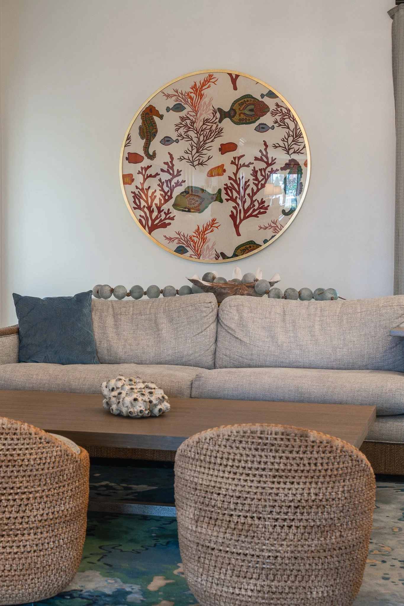
For one of the project's larger pieces we sourced an amazing linen embroidery from Parisian master fabric makers Pierre Frey. On framing this piece, we settled on a circular framed orb; drawing from a submariner's view through a round porthole - the gold distressed moulding, again pulling in the concept of ‘submerged treasure’.